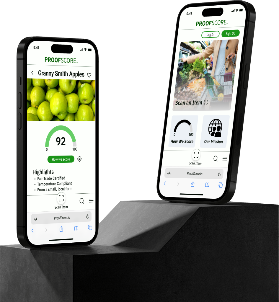
What is ProofScore?
ProofScore is a mobile dynamic website made by Transparent Path. The goal is to use transparent data on shipping, storage, safety, provenance, etc., to create a score by which to judge products like food and feel assured they are of the quality expected.
What did we do?
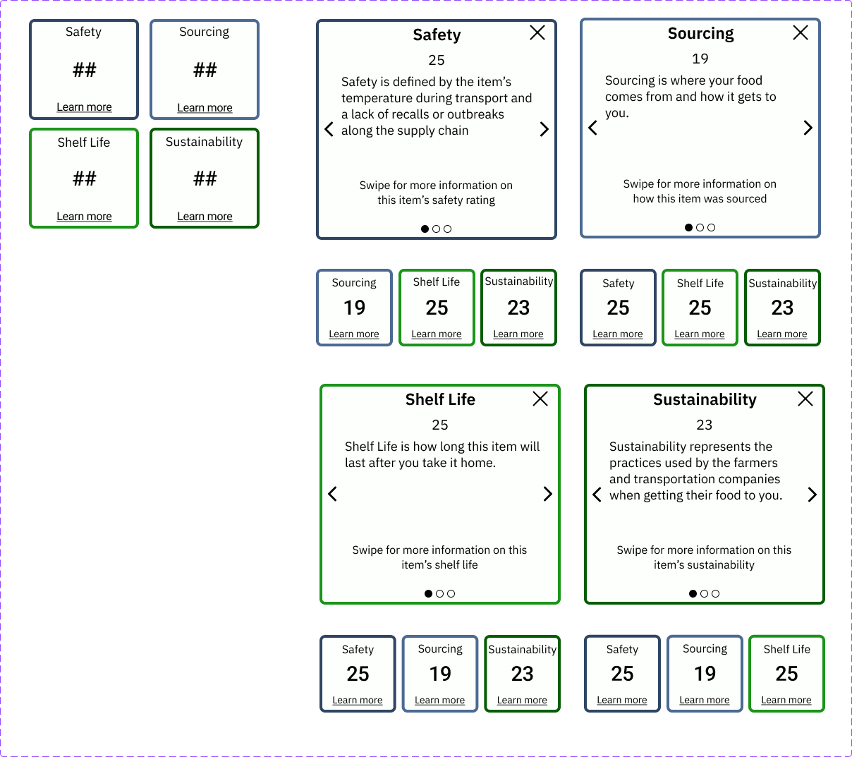
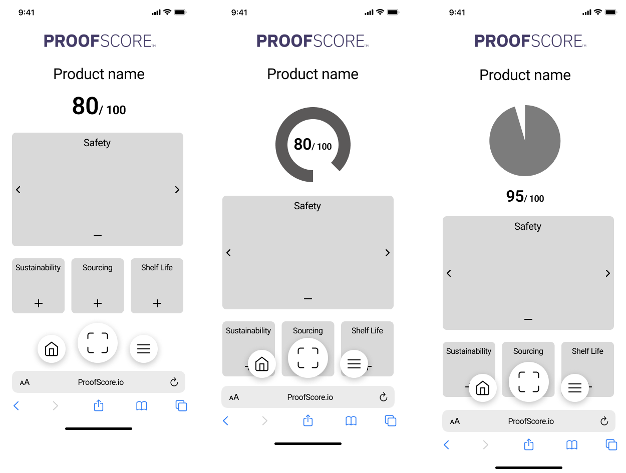
Given a large body of prior UX research, our team designed a look and feel for what a "Proof Score" would be. We broke down what customers found most important to know about their products into four categories, and backed them up with industry expert insights. With those details laid out, we sought out methods to house a large amount of information in small packages, which led to the creation of our carousel cards and the fun rotating interactions that give the site character.
Key Points:
- We researched a number of comparable "score" sites, such as Walkscore and Good On You, in order to get an idea for what established score styles look like.
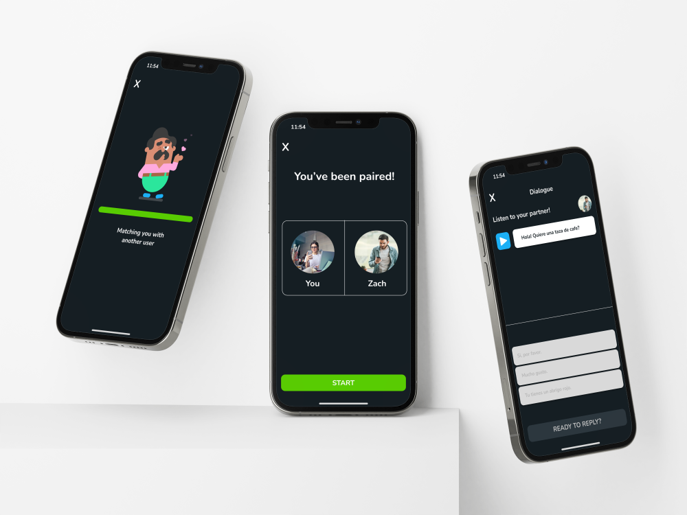
- One big challenge was just how much potential information could be stored for each item. Trying to prevent there being massive amounts of scrolling or clicking links, which customers could get hopelessly lost in, we quickly settled on the idea of the carousel cards. Having the cards collapse and expand, then scroll through the different potential information styles; maps, links, certificates, text, etc.; was our way of saving space and customer sanity.
- Because the site was meant to be used similarly to an app - in that it should work with the phone's camera on QR codes - the nav menu needed to be made with that in mind. We brought it to the bottom, and had the "scan" button, as well as the menu, in easy reach of a customer's thumb. If someone were to be using the app, they could move around and enter camera mode easily with one hand, just like taking a picture.
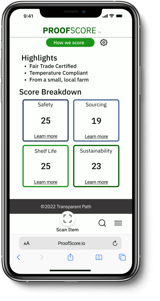
- A lot of attention to detail needed to be paid to the signals we were sending customers. "Learn More" was used instead of a simple "+", because it gave testers a better feel that there was more to actually read within each card. Small touches like that ensured navigation was intuitive.
My Contributions:
- The "4S" breakdown of the score was something I came up with while synthesizing our initial research. I wanted something that had that catchy sound like "4S", to make describing and remembering the breakdown easier.
- Fluidity of the carousel cards was a big deal to me. I didn't just want the expand and contract animation, as I thought it might look a little jarring. My idea was to have it actually move and create the in and out rotation of the different boxes, giving the site a little more life and visual interest, which one of our more critical testers described as "really fun".
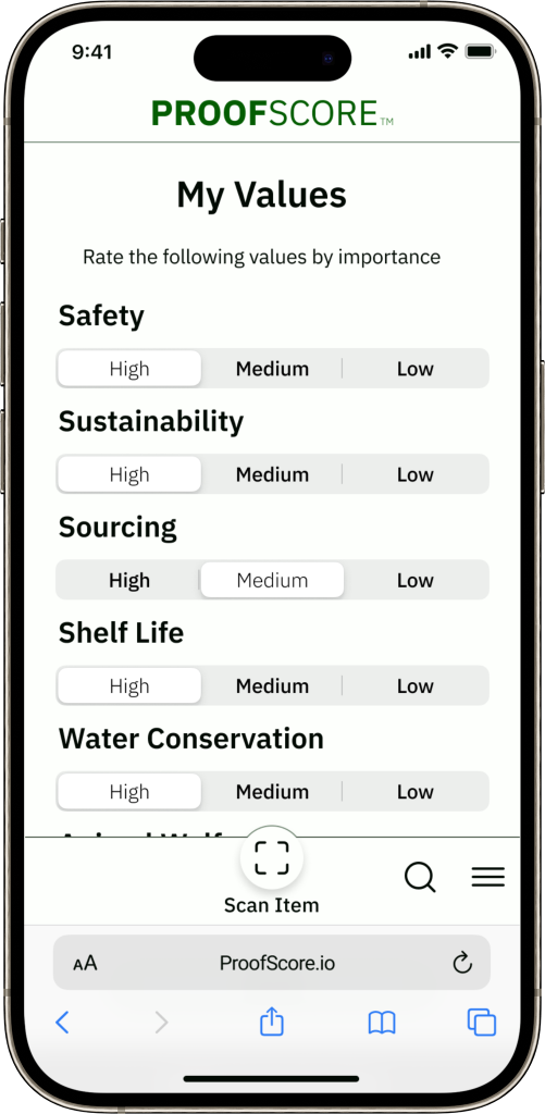
- I put a lot of work into our Settings page, including how users would want to interact, and particularly what granularity of detail our client would be able to provide on the back end.